
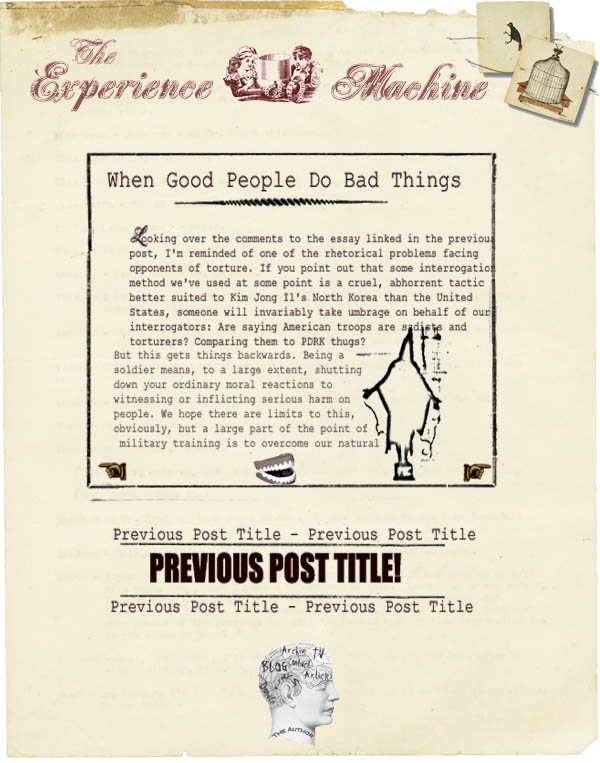
I’m tempted to just let the redesign be a surprise, but it seems silly to deprive myself of the wisdom of people who actually know something about design, if there are any of you out there. So, below the fold (for those of you who prefer surprises) a very, very rough/tentative mockup of what the new look of the blog might be. I don’t need specific comments at this stage, since I guarantee that the final product will look quite different—this is just something I tossed together as a quick-and-dirty outline.
Update: Made some minor modifications for legibility. Still trying out various looks, so don’t panic if you hate this one.
Update II: Never mind. It’s obviously a bit silly to ask for comments at this stage of the process, and at the level of generality I was going for. Rest assured that none of the things people actually find awful about the mockup ever had any risk of making it into a real layout.

13 responses so far ↓
1 Realish // Nov 5, 2007 at 4:11 pm
Ugh. Man. It’s 2007. Fussy, busy, faux-paper designs are very 2003.
Remember: people come here for the content. They come for your words. Your overriding priority should be to make it as easy as possible to consume the words. Dark text on a dark background: harder to read. Goofy hand images rather than the more familiar “previous” and “next” text links: harder to navigate. Large, aren’t-I-clever banner image and title that push the actual content halfway down the page: obscures the words people came for.
Your guiding design principle should be: get out of the way. Nobody who visits your site cares about the design or particularly wants to think about it. They just want to read what you write. Don’t get in their way.
Sorry if this is harsh. I’m a big fan. But this design seems like a big step backwards.
2 me // Nov 5, 2007 at 4:25 pm
…tis a gift to be simple…
3 Lee // Nov 5, 2007 at 5:06 pm
Disarming compliment: You have really smart content.
Criticism: I think that layout is kinda cool, but overwrought for a blog.
If you have serious content you want me to read rather than skim, it needs to be black on white, perferably set in narrow, fixed-width columns.
If you think your content is sufficiently smart and serious that you can just indulge your eccentric taste, that’s fine. You probably can.
But beware, you might end up with a Bryan Caplan-like website.
http://economics.gmu.edu/bcaplan/
What’s up with libertarians and your eccentric website designs?
4 Amber // Nov 5, 2007 at 5:23 pm
Everything about it is too hard to read. Different fonts, please, and make the navigation links more straightforward (“Older” & “Newer”). The graphics are okay. Good title.
5 tde // Nov 5, 2007 at 5:44 pm
Ugh – horrible.
Current design would be fine without the dotted line.
I come for the words. Not frilly, eccentric pseudo-retro nonsense.
6 LP // Nov 5, 2007 at 5:45 pm
How about this: make super-cool, interesting, faux-antique masthead, even creating new ones when the artistic impulse comes over you (a la Dooce), but keep the content clean. The beauty of the blog format is that it enables readers to assimilate your thoughts quickly by following fairly standard formatting conventions and using sans-serif fonts (easier to read on a screen).
On the other hand, probably almost everyone reads you by RSS anyway, but a difficult-to-read blog format risks alienating first-time visitors who are insufficiently patient.
7 catherine // Nov 5, 2007 at 8:44 pm
the font is unreadable; i’d remove the line around the text box as well and make that column wider. the header and the title are cool.
8 Rue Des Quatre Vents // Nov 5, 2007 at 8:50 pm
Straight out of Pearl Jam’s Vitology.
9 Oy // Nov 5, 2007 at 9:01 pm
I love how he said “no specific comments at this stage” and then everyone gave a bunch of specific, critical comments.
10 Eric the .5b // Nov 5, 2007 at 9:22 pm
Does “Ick” suit you better?
11 KJ // Nov 5, 2007 at 10:33 pm
I guess I’m the only one who likes it. I used to like the simple look, but it seems everybody is doing it these days. I think this new design is stylish.
12 Anonymous // Nov 11, 2007 at 3:24 pm
Brutal, stylish only in the eyes of people who confuse glitter for gold.
The current design is good enough.
13 Barry // Nov 13, 2007 at 11:09 am
I agree with the notion that the faux-paper is really, really bad. It gets in the way of the words, which is a damning criticism.